How to Work with Bold Colours
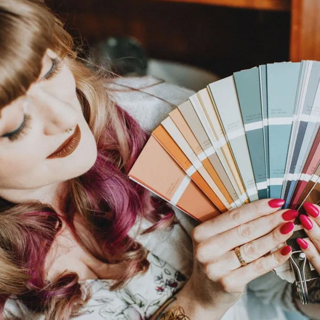
In this blog, we'll explore:
✔️ How rich, dramatic colours can transform a space and make a striking statement.
✔️ Expert tips on pairing deep shades with complementary hues, textures and finishes.
✔️ Everything you need to know to prep, prime and achieve a flawless colour refresh.
✔️ Why working with a colour expert makes all the difference.
The Strawberry Moon: A Little Cosmic Colour Inspiration
Every year, as June rolls in and the days stretch longer, the full moon takes on a special meaning. Traditionally named the Strawberry Moon by Indigenous peoples and early farmers, today’s full moon marks the time when wild strawberries ripen, symbolizing abundance, renewal and the richness of the season.
Beyond its name, this moon carries a deeper message for me. It’s the season to embrace life’s fullness! Whether it’s in nature’s bounty, personal growth or the colours you surround yourself with, richness is meant to be enjoyed. And just like a perfectly ripe berry, your home can radiate warmth and vibrancy through thoughtful colour choices.
If bold statement colours aren’t for you, please don’t click away! I have painting advice for blocking out a dark shade that’s outstayed its welcome. But for my colour lovers, buckle up! The Strawberry Moon is all about abundance, richness and going boldly where beige fears to tread. If there was ever a time to embrace deep, dramatic colours, it’s now, but knowing how to work with strong colours makes all the difference. Done right, they add depth, sophistication and just the right amount of drama.
Going Bold: Choosing the Perfect Deep Colour
Let’s talk about commitment. Choosing a bold colour means owning it. None of that “maybe just one tiny accent” hesitation. We’re talking rich, juicy shades that transform your space into a full-bodied, head-turning masterpiece.
If you’re a trend-watcher, you may have noticed that colour drenching is taking the design world by storm. Colour drenching is the technique where walls, ceilings, trim and even doors are coated in a single, dramatic hue for a truly immersive effect. Deep jewel tones like emerald green, sapphire blue or rich berry shades create an enveloping, luxurious atmosphere that feels both daring and sophisticated. It’s a look that demands confidence but rewards you with breathtaking impact.
Here are some of my favourite deep dark tones from Sherwin-Williams that bring serious wow factor:
Blackberry (7577): This is a deeply saturated red-based purple, with a tiny undertone of brown. It’s a rich colour, but slightly muted, bold but not garish. It’s a perfect pairing to pale greys like Light French Grey (0055), or warm whites like Westhighland White (7566)
Roycroft Bottle Green (2847): I feel like I could literally sink into this gorgeous hunter green from SW’s Arts and Crafts collection. It seems to go on forever. The tone is fresh and vibrant while still being enveloping, living up to the imagery evoked by its name. Stunning with a crisp cool white like Ultra White (9500).
Dress Blues (9176): Dress Blues has got to be the perfect navy blue, heavily saturated, with a hint of indigo. It’s dark, without being dreary, and pairs beautifully with blonde woods, rattan, or travertine stone. Linen tones like Natural Choice (7011) are the perfect neutral with this moody blue.
Building a Colour Palette That Sings (Not Screams)
Deep colours have presence, so creating balance is key. Here’s how to make sure your palette looks intentional, not like a colour explosion gone rogue:
Start with an anchor shade. This is your main character, the shade that sets the tone for everything else in the space. It can be a neutral, a metallic, or an undertone; but choose one foundation, and build from there.
Layer supporting hues. Think of finding sidekicks for your main character. Seek out tones that enhance your anchor colour without stealing the show. Complementary colours are a good place to start, as their opposing relationship on the colour wheel is most pleasing to the eye.
Mix textures and finishes. Matte versus glossy? Natural versus industrial? Smooth versus rough? These little details make all the difference! Pick what appeals to you the most, then apply the 80/20 rule, to create balance and interest in your space.
Look beyond walls. Of course, colour isn’t just for paint! Let it flow into your furniture, textiles and accents… I love a neutral living room full of lush, vibrant and interesting accessories. This is how you truly make your space your own!
Painting Over Deep Colours: A Little Extra Love Required
Okay, so here’s some real talk. As much as I love depth and colour, sometimes bold shades have had their moment, and it’s time for a refresh. If you’re into design, you’ve undoubtedly gotten caught up in a trend at some point and regret a paint colour or two (I’m looking at you, my chocolate brown bedroom from 2005!) Deep pigments are a little stubborn, but with the right prep, you’ll get a flawless finish for your new colour story:
Primer is your new best friend. Skipping primer is asking for trouble when dealing with strong colours. The old pigment can sneak through and affect your new selection, giving a muddy, messy undertone. When in doubt, choose something like Zinsser’s “Bin 123”, a primer with stain-blocking properties that can help neutralize the existing colour.
High-hide formulas are worth it. Not all paints cover deep hues equally! Look for high-opacity formulas designed for bold shades. Self-leveling attributes can also help, and matte finishes hide more imperfections in the walls as well.
Be patient with multiple coats. Some deep colours need a little extra TLC before they fully disappear. It once took me 5 coats to paint over a stubborn plum purple! If you don’t think you can handle the time it takes to get rid of a dark colours, it’s certainly worthwhile to talk to a professional painter about taking on the project for you.
Ready to Bring Colour to Life? Let’s Make Your Dream Palette Happen
Choosing and working with deep, bold colours is an art, and having an expert guide the process makes all the difference. Whether you need help selecting the perfect berry shade or ensuring flawless application, I'd be honoured to help bring your vision to life! Let’s create a colour palette that feels effortless, timeless and uniquely you. Get in touch and let’s make your space unforgettable.
Book a colour consultation with me, and let’s create your perfect paint scheme. 😊🏡✨