Green… for Fall?
Meet the Two Greens!
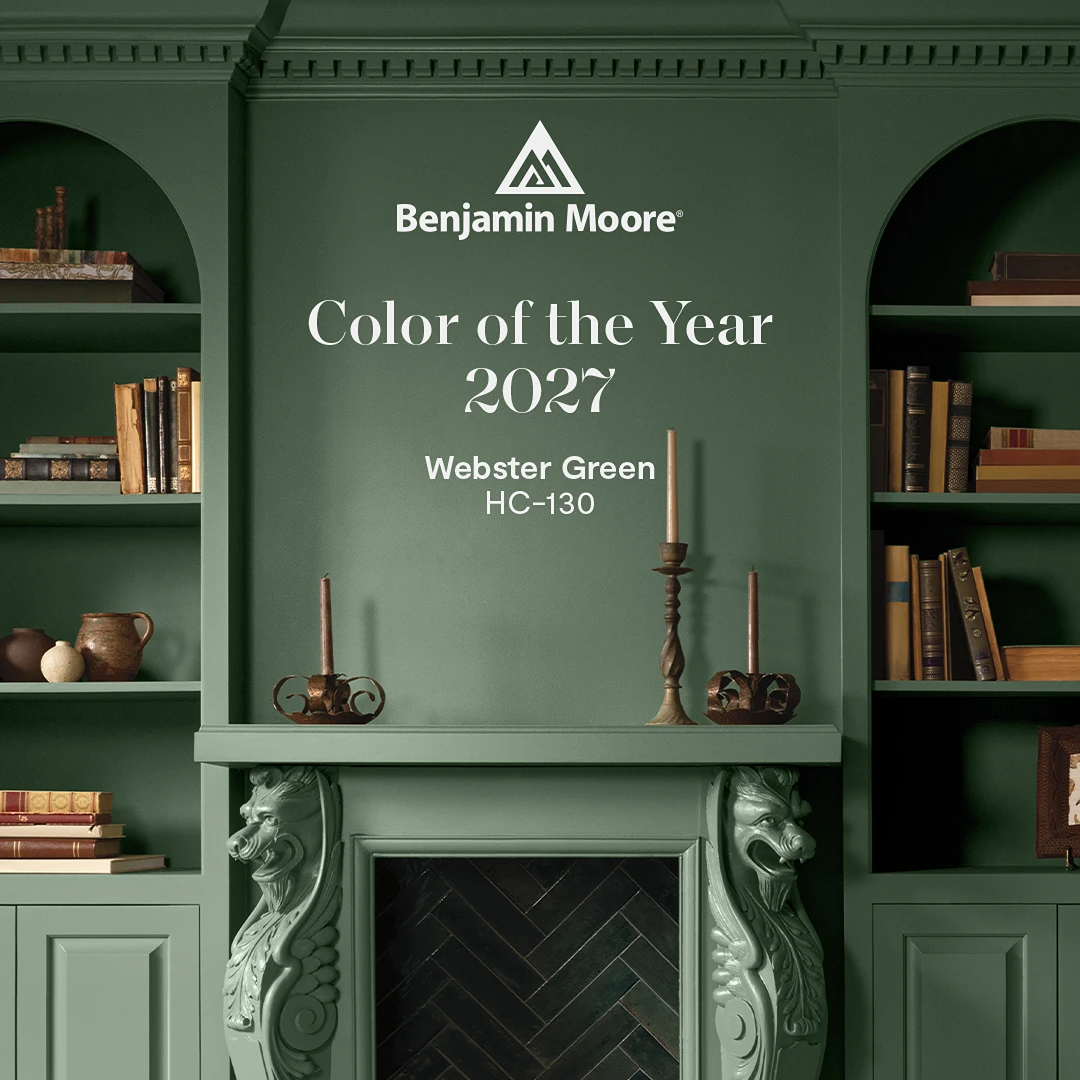
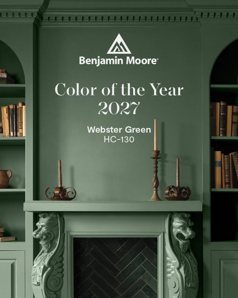
Now, to be fair, Benjamin Moore went with Webster Green, which is much more in keeping with the season. It’s a deep, smoky jade that makes me think of a library in a British country estate, with a fireplace, a leather chair, and a comforting cup of Earl Grey. It also feels like the cousin of a tone I’ve seen called “millennial green,” the moody shade that has been quietly replacing cool grey since 2025. Rich, cozy, and a little theatrical. And you know I’m here for theatrical!
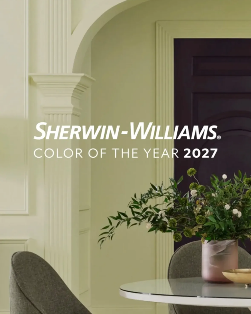
Sherwin-Williams went with Celery, a soft, almost pastel green with a yellow whisper in it. I’ll be honest, I’m cautious on this one. It reads a little retro (and not in a good way), and the undertone feels slightly sickly to me. But colours have surprised me before, so I’m curious to see how Sherwin-Williams promotes it and how designers put it to work.
So Why Green, and Why Now? Here’s what I think is going on underneath it all: green represents hope. It’s the colour of things growing back, and choosing it as we head into the darkest months feels like a promise that spring is coming, literally and figuratively. Green is also (obviously) the colour of nature, and so many of us are craving it. We’re tired, we’re scrolling too much, and we want to feel closer to the real, living world.
And green is calm. Peace. Connection. Everyone I talk to wants a space that truly feels like home, and the right green delivers that sense of reflection and relaxation, like a deep breath. Think of a walk in the woods, surrounded by all that fresh air the trees give us! Which leads me to my favourite point, inspired by nature and true of any colour: nobody has to choose just one shade. For interiors, the cooler colours offer an especially gorgeous spectrum to play with (think green, blue, and purple). Wherever you land on the colour wheel is the right place, as long as it lights you up.
I Can't Wait To See Pantone's 2027 Colour!
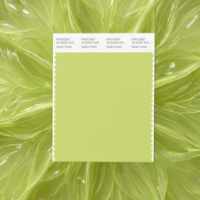
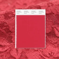
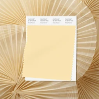
Pantone haven’t announced their 2027 colour of the year yet, but they seem to be feeling this sentiment too. Their own words about the New York Fashion Week Spring/Summer 2027 trend palette talk about joy, connecting with the natural world, and being playful. If you’ve followed me for a while, you know I wait with bated breath for Pantone’s colour of the year announcement every year. Their Fashion Week palette has me very excited. Daiquiri Green, the perfect shade of lime. Hibiscus, a deep, almost red pink. Anise Flower, a powdery warm yellow. All very much in the “Shona palette”! Fashion has a way of sneaking into our homes, and I would love to see more people say yes to colour, even in small doses. A cushion. A lamp. A vase. One brave chair. This is how you find the joy in the corners of your home where you least expect it.
I’m also excited because Pantone added 224 new colours to its library this year, and some of its recent Instagram posts have been bright, saturated, and leaning into pop art. So what will they choose for 2027? Maybe it’s one of the new ones! Maybe it’s a bold surprise! I have to keep waiting, of course, but I’m putting it out into the universe: please, anything but another white. (This year’s Cloud Dancer gave us a very polite, very quiet, perfectly lovely blank canvas, and… I love you, Pantone, but come on! Let’s go with a little more oomph this time!)
Anyway! I’d love to hear what you think of these two 2027 greens, and if you have any predictions for the Pantone colour of the year. If a green interior has been whispering to you (or if you want to scream “anything but another white” into the void with me), visit my contact page to book a complimentary 30-minute call! We can chat about what makes your heart beat faster, and where colour, green or otherwise, could live in your home.
Thanks so much for reading... let’s go get weird with some green!
Shona